Korea's only public comprehensive testing and certification organization Customer makes KTL
Customer makes KTL
Organization
CI
WORD MARK
The word mark modernly expresses KTL’s confidence based on advanced technology, over forty years of reli-ability built up between customers and enterprises, and international sense and image that KTL sets the world
standards as Korea’s representative institute.. The stable symmetrical shape and the directional triangle
(point) towards the center signifies the confidence of KTL as Korea’s No. 1 testing laboratory and our progres-sive mindset as the leader of Korean domestic enterprises making an impact on world. The blue color represents pride and infinite reliability as Korea’s top testing evaluation laboratory, and the red color stands for the progres-sive spirit of the organization as a leader in technology standards.
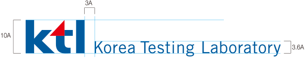
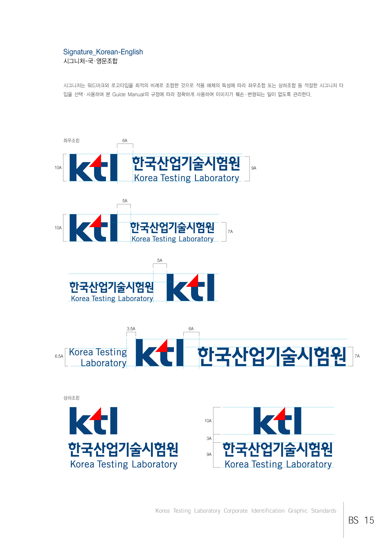
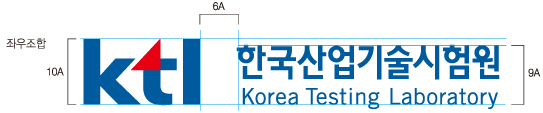
SIGNATURE
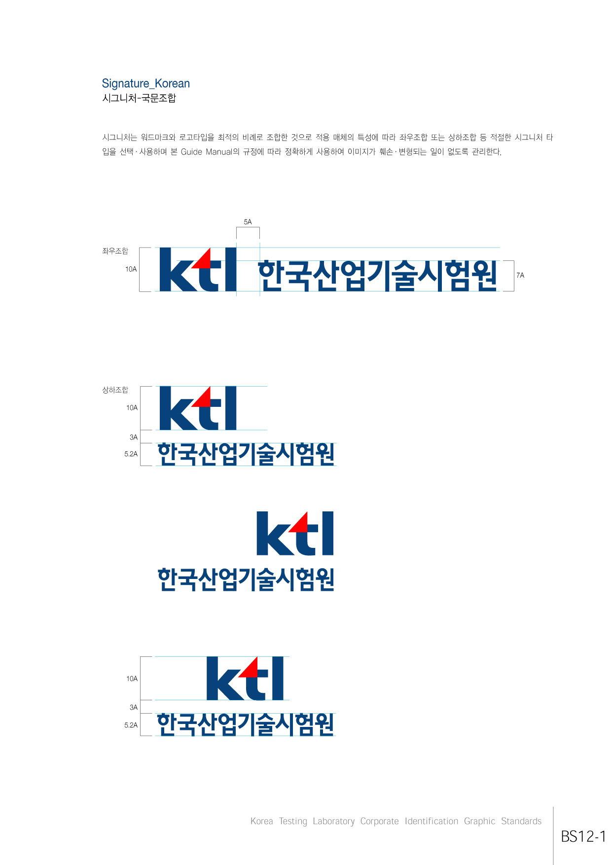
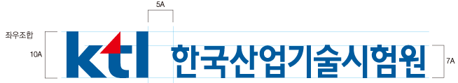
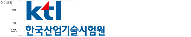
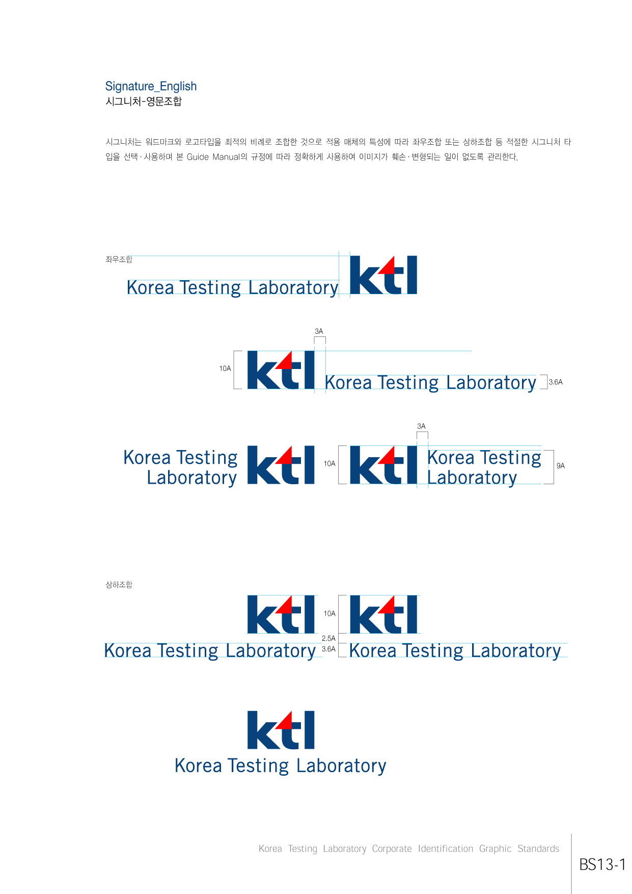
The signature combines the word mark and logo types at the optimum proportion and shall be protected from image damage or deformation through precise use in accordance with this Guide Manual after choosing and using the proper signature type of left/right signature or top/bottom signature for appropriate media.
A Type - Korean signature
B Type - English signature
C Type - Korean/English signature

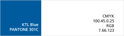
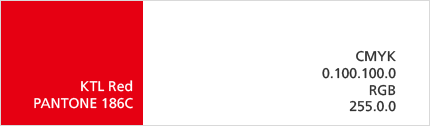
Exclusive color
The exclusive color expression will be PANTONE color (name of color mix table by Pantone Inc.) for print media, but 4 primary printing colors can be used, depending on the nature of the applicable media. The color expression may have subtle differences due to the printing method, ink concentration, and paper features, but it must use the recommended colors (or the most similar colors when unavoidable). Although the colors must follow the specified color values, fine adjustment is allowed for the proper situations.
10, Chungui-ro, Jinju-si, Gyeongsangnam-do,52852, Rep. of KOREA TEL.82-80-808-0114
Copyright 2014 ⓒ Korea Testing Laboratory All Right Reserved.

이메일 무단수집 거부
무차별적으로 보내지는 타사의 메일을 차단하기 위해,
본 웹사이트에 게시된 이메일 주소가 전자우편 수집 프로그램이나 그 밖의 기술적 장치를 이용하여
무단으로 수집되는 것을 거부하며, 이를 위반시 정보통신망법의해 형사처벌을 유념하시기 바랍니다.
한국산업기술시험원
팝업창 닫기